When Kirkland’s came to us, its problems were clear. Low brand awareness—and even brand confusion—was one hurdle, the other was disjointed messaging that toggled between heavy sales promotion and trend messaging. A defined POV that sparked an emotional connection was critical for the brand to grow in a way that attracted new millennial shoppers, without alienating current customers.

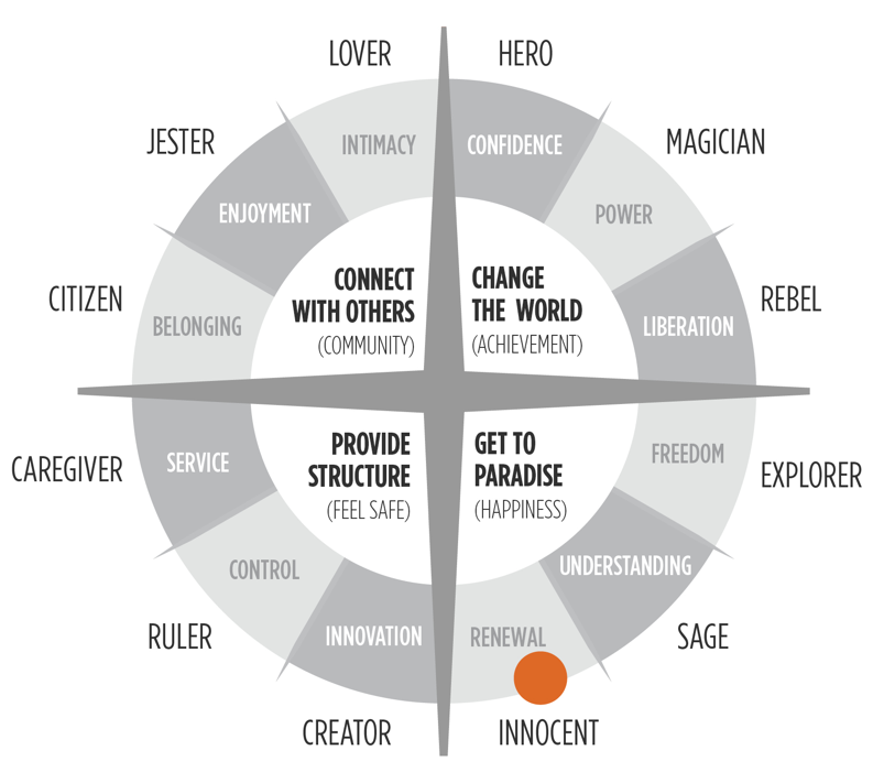
We started with a comprehensive branding workshop designed to get Kirkland’s senior leaders, creative team, and marketing team on the same page to set their 425 stores up for success. A deep dive into everything from the competitive landscape to future goals set the stage for an archetype mapping exercise that yielded surprising results, and helped the team define who their core customer is, and the best ways to target her.

Our archetype mapping exercise revealed that Kirkland’s core values of renewal, happiness, and optimism put the brand in a unique position to own the Innocent archetype. By supporting the human yearning for paradise and renewal, the brand could powerfully deliver on one of the key emotional drivers behind home decorating—creating a happy place for all who dwell there.

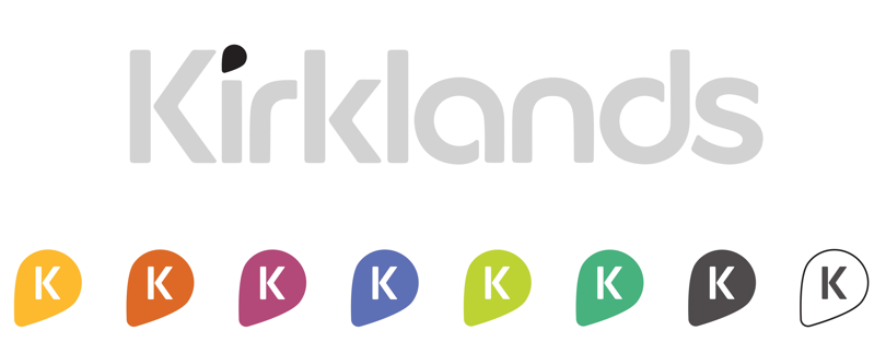
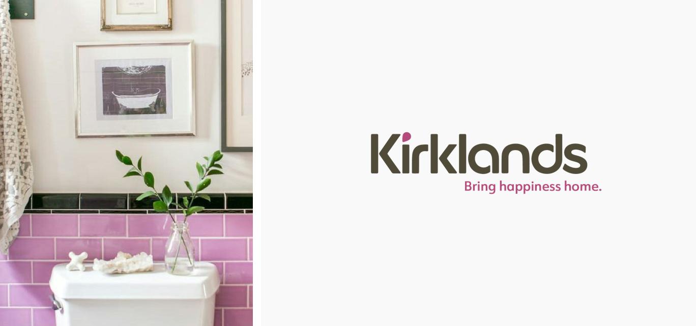
The first piece that needed to come out of the new strategy was a new logo, one that elevated the cornerstones of the Innocent archetype, and felt playful, contemporary, and feminine. We tested and adjusted several iterations of the logo until it nailed the archetype, was validated by customers, and was universally adopted by the team—all were critical for moving forward. A new tagline was created for two key reasons: to provide instant clarity in the competitive space, and to cement the emotional bond between the new Kirkland’s and its customers. Lastly, a revamped color system solidified the new cheerful, vibrant look of a brand dedicated to helping customers bring happiness home.
